Chapter 3 - Artwork
Righto, and now we get to the fun stuff, making and importing graphics for our game! Before we begin though, there are a few basics that we should cover before moving on. This extra information will make the later sections easier to work with.
By the End of This Section you Should...
- know the color limitations of the OHRRPGCE
- understand palettes and how they affect a game's artwork
- understand some basic art terms and concepts regarding colors
- be able to import a new master palette
Contents
Color Limitations[edit]
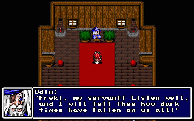
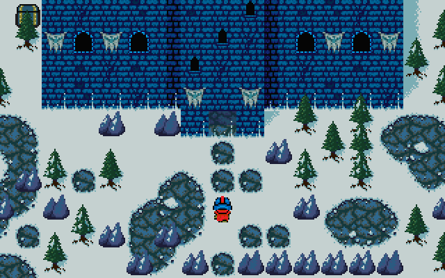
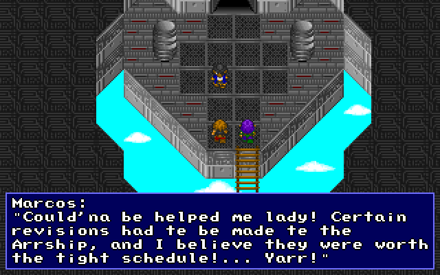
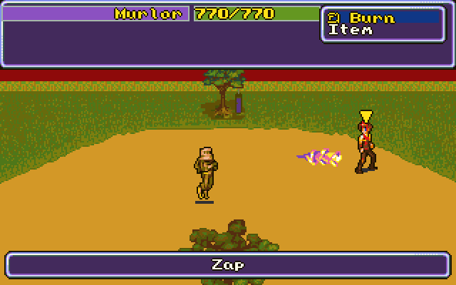
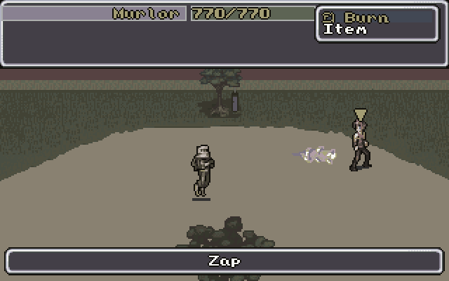
The OHRRPGCE is primarily designed for making games like the old Super Nintendo games, and as such, faces similar limitations. While modern games can easily contain millions of colors, the OHRRPGCE is limited to 256. Only 256 colors you say? How will you ever get a great looking game with only that many colors? It's quite possible I assure you. Just take a look at these examples to see just what you can accomplish with the color limitation.
See? 256 colors is hardly a death sentence for your game. In fact, many of the classics such as Chrono Trigger, Seiken Densetsu 3, and Final Fantasy VI were also limited by 256 colors. The key then, is managing said colors correctly. The art for these games is called "pixel art" because rather than working with wide swathes of color, the graphics are manipulated pixel by pixel, and can thus be a very painstaking process. Still, with enough practice, you can achieve great results.
Drawing great pixel art, however, is beyond the scope of this particular tutorial, but there are many sites out there on the Internet that deal more specifically with the subject. If you're interested, you can read the page on this wiki dedicated to the topic. Don't make the mistake of getting bogged down with drawing well though, as there's much more to learn. And on that note, let's move on to palettes.
Palettes[edit]
A palette is a set of colors that you can choose from for your game. There are different types of palettes in the OHRRPGCE, but the first we'll concern ourselves with is the master palette. The master palette is the overall palette from where all the different colors in your game will be chosen from. The OHRRPGCE comes with a default palette that should contain more than enough colors for your first game. While it's certainly not perfect (and hardly any master palette could be considered perfect) it will more than suffice.
Pro Tip |
 |
|
As you progress with making your games, you will inevitably feel the need to tweak the colors to suit the mood of your game better. This is certainly possible, and many OHRRPGCE developers do indeed use different master palettes. Still, it's advised that you learn with the default palette first. That way, you can get a better feel for what works and what doesn't and if you decide to make your own master palette, you'll have a good idea as to what you need. |
|
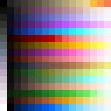
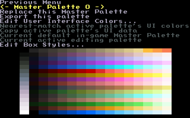
The default palette that the OHRRPGCE ships with is Neo's Better Palette. You can see it below, and as you can see, it's organized nicely allowing for the easy location of whatever colors you need for your game.
As aforementioned, this is not the be-all, end-all for palettes. You can view this palette, and change master palettes, very easily. In fact, the first major thing we'll do is to change this master palette. We won't be making any drastic changes, but the change is an important one for later chapters.
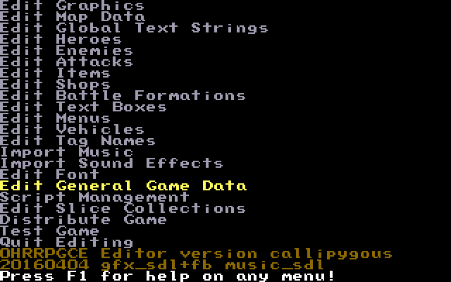
To do this, fire up Custom and load up your game. From the main menu, select, "Edit General Game Data".
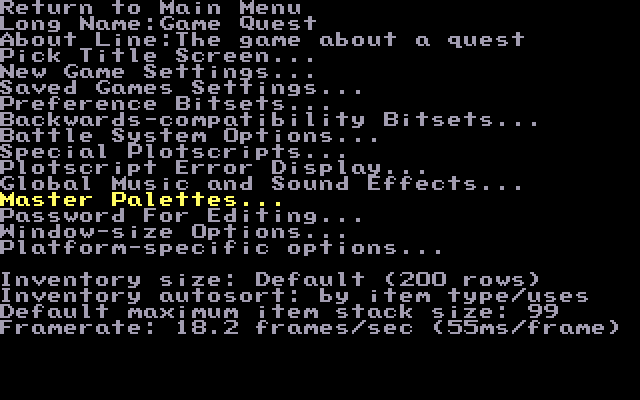
You should now see the General Game Data page that we looked at in the previous chapter. We won't be changing anything on this menu this time though. This time around, select "Master Palettes..." near the bottom.
You will now be presented with a screen that shows you the current master palette being used. While it may not be spaced the same as the picture above, you should be able to tell that what you have before you is the same as the smaller image shown previously. It is, however, easier to get a view of all the different colors available to you.
Before moving on to anything else though, and before importing a new palette, let's cover a few basic concepts that will help later on when you're drawing your graphics.
Basic Palette Concepts[edit]
Now, these concepts aren't typically associated with game-making, rather, they're associated with art. But as most OHR games are made by single individuals doing the art, coding, and developing, it's a good idea to have a grasp of these concepts. They are fairly simple to grasp, and you don't need an art degree to get a hold of them. Also, we'll be using these terms along the way in this tutorial (particularly in this chapter) so it's best that we get them out of the way now.
Contrast/Brightness[edit]
Contrast and brightness are two rather closely linked concepts. Brightness is perhaps the easiest to explain. As the name would imply, brightness is how bright a certain color is. Take a look at the image below.
In this image, the color blue goes from dark blue to a very bright blue. The left end has low brightness, while the right end has high brightness.
Contrast comes into play here as well. Contrast refers to how much two colors visually differ from one another. Two colors with high contrast are easy to distinguish from one another while things with low contrast are difficult to distinguish from one another. In the above image, each step in brightness has enough contrast that it's possible to tell the different colors apart. If you were to place the two ends side by side though, the colors would be even easier to tell apart. This comes into play when getting graphics to "pop" out of the background. Take the following two images for example.
In the image on the left, the figure doesn't pop out as much as the figure on the right. This is because the edges of the figure on the left do not contrast enough with the background (among other problems, but we'll get to that later). The edges and colors of the figure on the right however, contrast better with the background allowing it to be more visible on the map.
Hue[edit]
Hue is a slightly more difficult concept to grasp. To put it simply, hue is the "identity" of the colour. When we talk about colours like red, yellow, blue, purple, pink, etc.; the difference between those colours is hue. In the image below, the colours shift across the hue spectrum: red, orange, yellow, green, blue, purple, and back around to red.
Furthermore, all colours have complimentary or "opposite" colours. When used together, these colours stand out, or "clash." Take a look at the example below:
As you can probably tell, the blue text on a red background stands out very well (so well, in fact, that it looks eye-bleedingly terrible). When that same blue text is put against a cyan background, it's much easier on the eyes.
Saturation[edit]
Saturation is a measure of the "intensity" of the colour.
To get a better idea of what a shift in saturation means, take a look at what happens when we play with the saturation values in this screenshot from Motrya. Here's the original:
Now watch what happens when we crank up the saturation by 75%:
See what happened? The colours got a lot more intense! Now watch what happens when we reduce the original image's saturation by 75%:
As you would expect, the colours got much dimmer, almost black and white!
Importing a New Palette[edit]
Now that we've got that out of the way, let's get back to palettes. Neo's Better Palette is pretty good, but it has one glaring flaw: the top-left colour is black.
The problem with that is the OHRRPGCE defaults the top-left colour of a master palette to the transparency colour. What that means is any time that colour occurs, it will be replaced with transparency. You can change which colour is used on a per-palette basis, but it gets a bit annoying after a while.
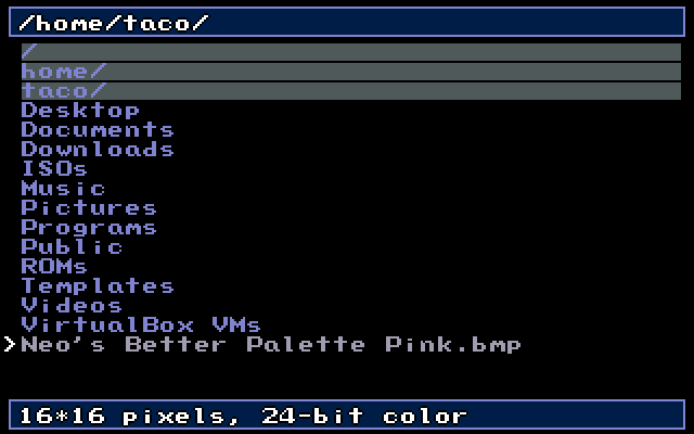
We'll fix that by loading a new palette into our game: Neo's Better Palette Pink. The only difference will be that the transparency colour is replaced with a bright magenta, which is much easier to draw against.
First, download this zip file containing the .bmp file and unzip it somewhere:
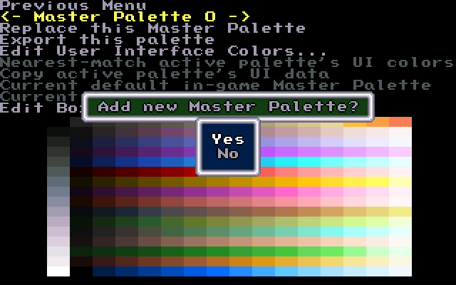
Then, in the master palette menu, (where you should already be) press right to add a new master palette.
Choose "yes" and navigate to where you extracted the palette.
To set it as the game's palette, select "Set as in-game Master Palette." To set it as custom's palette (which you probably want to do as well), select "Set as active editing palette."
And just like that, you have your palette ready to use! Easy, huh? In the next section, we'll make a basic tileset.
(Below is a download link for the project with all of the changes we've made)
Introduction | Getting Started | Artwork | Map Construction | NPCs | Tags | Making a Hero | Attacks | Items | Battles | Vehicle Use | Sound and Music | Text Boxes | Custom Menus | Slices | Plotscripting | Distributing a Game
Appendices: Keyboard Conventions | Sample Scripts
